Soleda
Working together towards a better environment.
category
logo & identity
client
Mark
It's a valid marketing position to sell the idea of cost saving products through renewable energy. However, Breen took the challenge to transition Soleda from a retailer of energy-saving products to an advocate of a better environment.
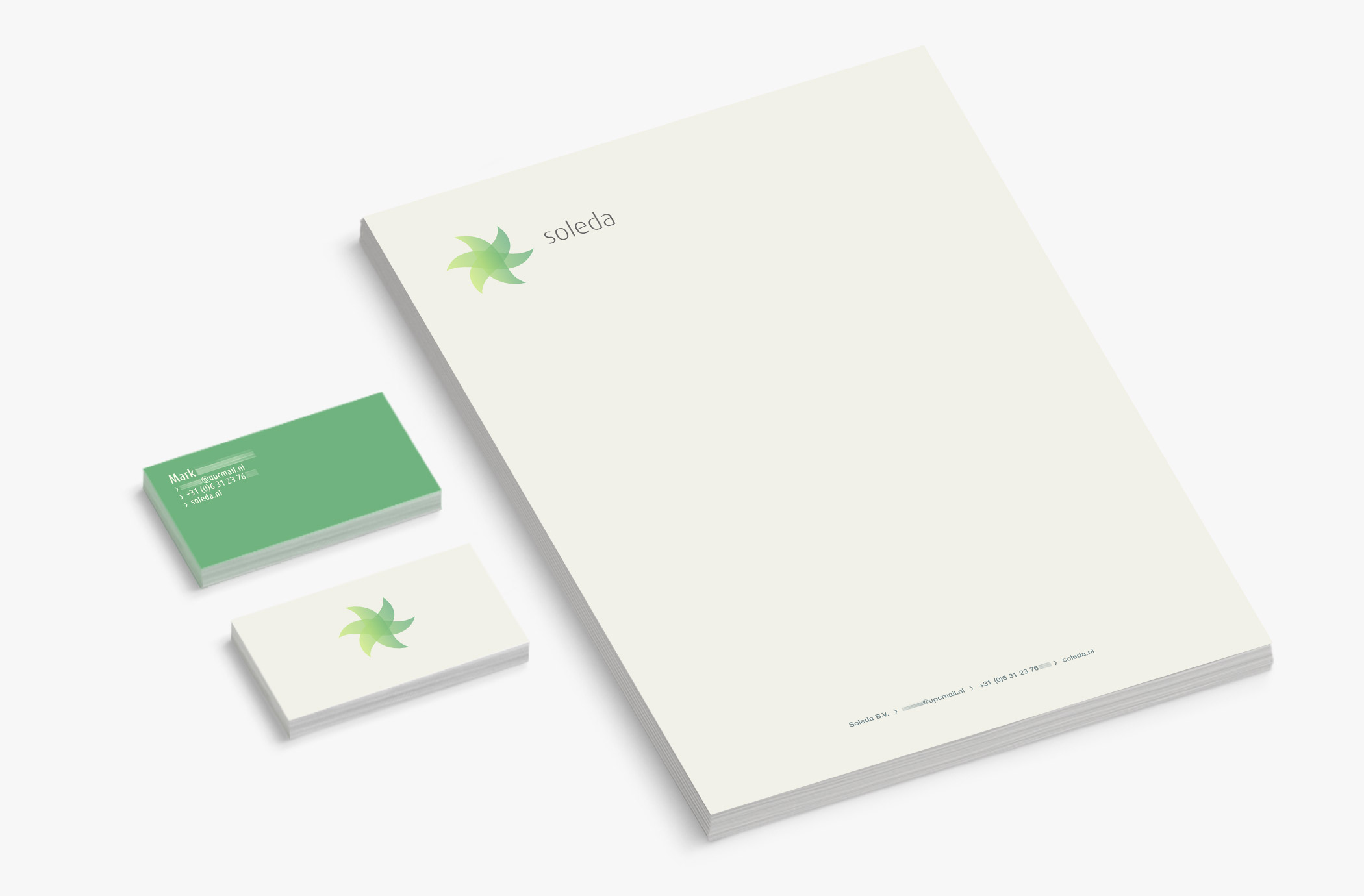
one step further
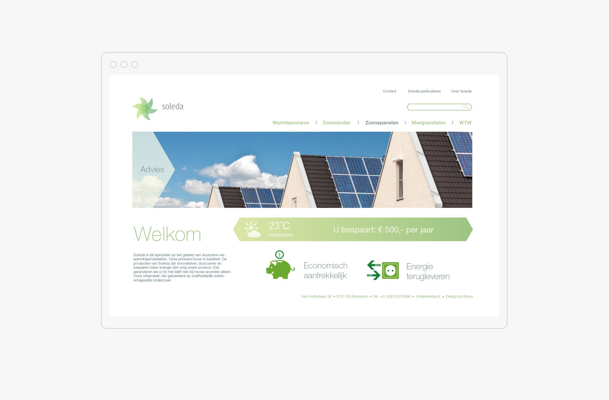
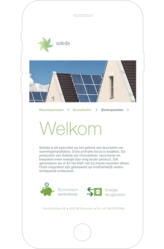
The former website focused primarely on cost saving products and felt somewhat technical. By figuring out the goals of the customer and by reimagining what the brand could be, the look and feel of Soleda completely changed. The focus shifted towards championing a better environment and making a deeper connection with the customer, sharing this common goal.
one logo, five meanings
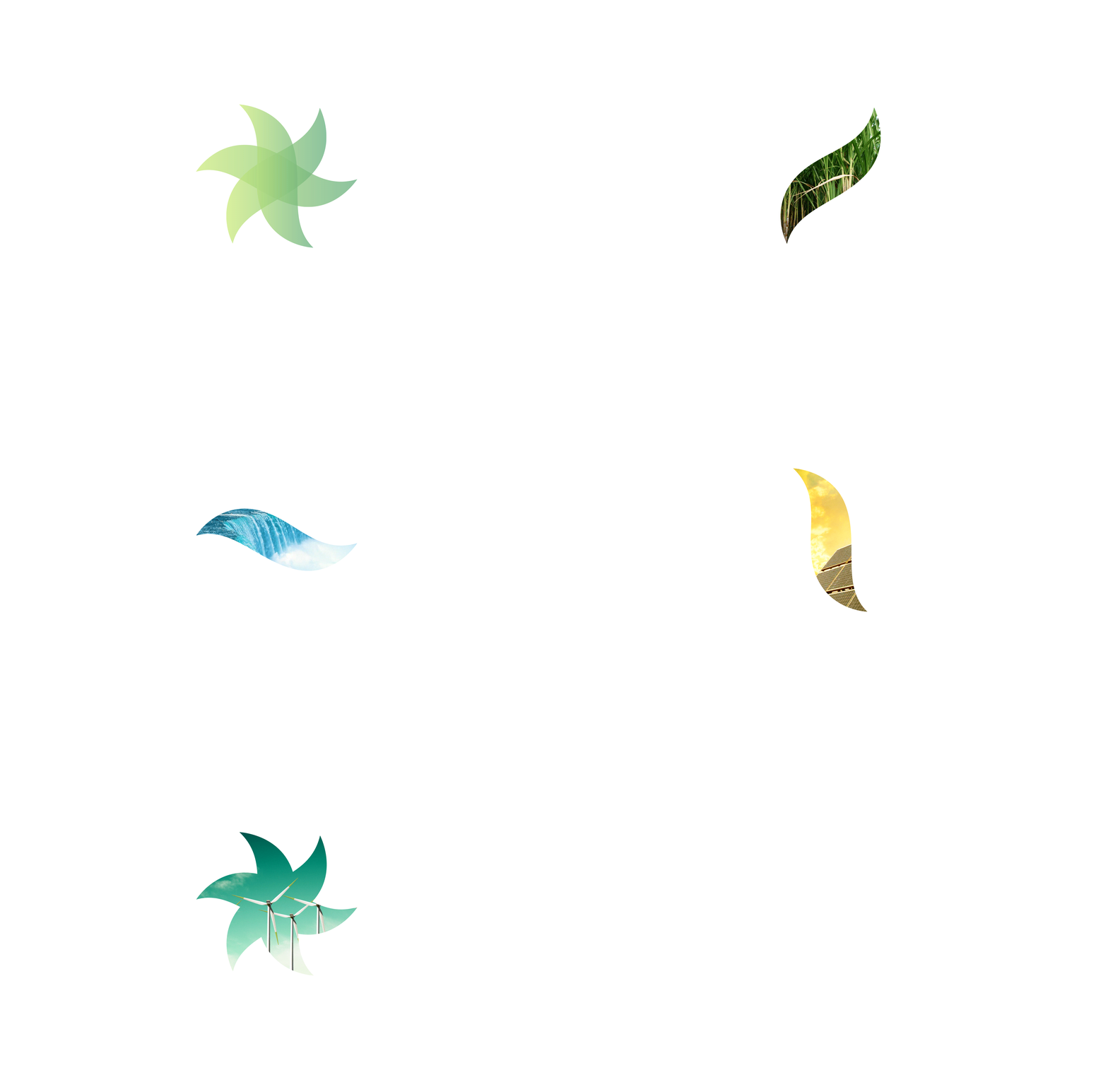
The logo refers to the meeting of three separate forms, each of which stands for a sustainable energy source – bioenergy, hydropower en solar energy. Together they create a form that suggests movement. Movement similar to a windmill and this symbolizes the fourth renewable energy source: wind energy. If you connect the end-points of the logo, it creates a hexagon; an efficient form from nature such as that of a honeycomb. As a result the website is light in tone and allows environmental awareness to go hand in hand with cost-saving products.