Nest
Creating growth in housing corporations.
commitment to lasting relationships
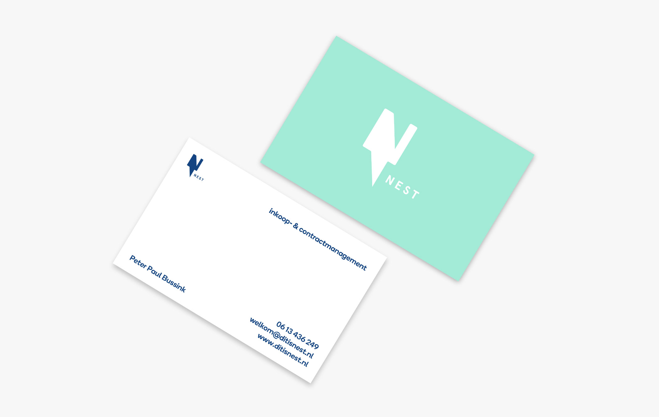
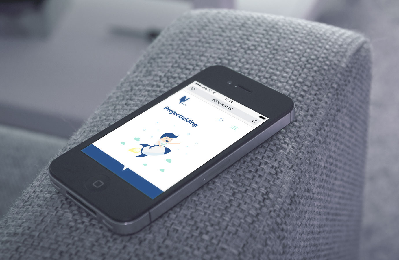
Nest provides procurement and contract management for housing corporations. Looking for a suitable profile, the ambitions of Peter Paul - the person behind Nest - were clear; create lasting relationships between corporation and suppliers. By connecting people and investing in mutual relationships, Nest is trying to realize a learning organization. These are often lengthy processes in which Peter Paul becomes part of the housing corporation in order to implement an insightful and manageable policy. He asked Breen to help develop a name, logo, house style and website for his newly established company.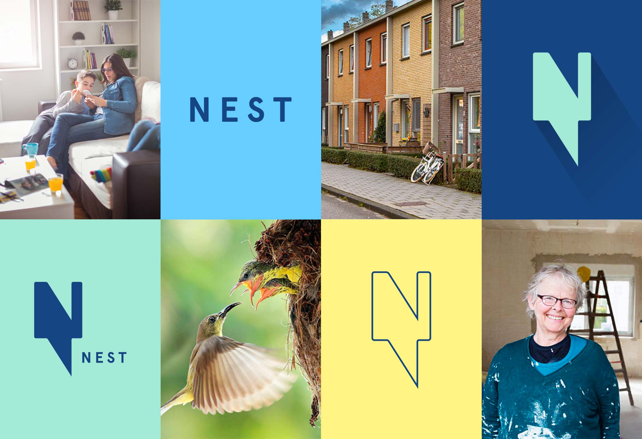
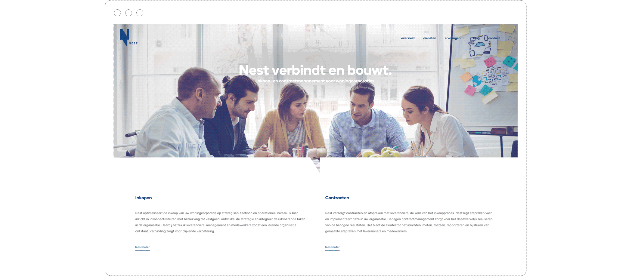
the name
The name ‘Nest’ is short, friendly and warm. It refers to a house; safe and familiar and so it represents the objective of housing corporations aswell as the social aspects that goes along with it. Nest also refers to the housing corporation’s ability to learn to stand on its own feet. In addition, Nest refers to nesting; becoming part of a team.
the logo
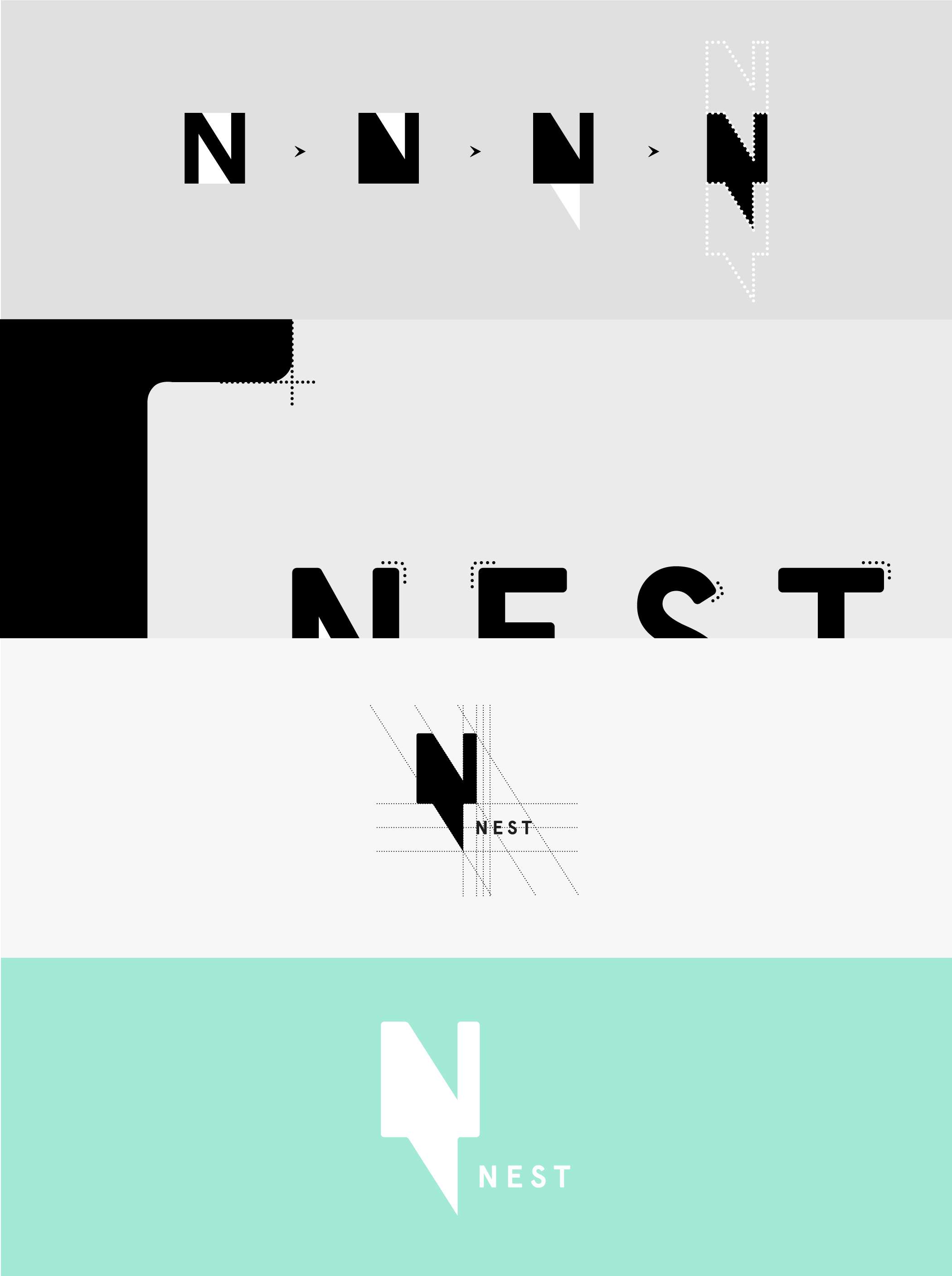
The development of the logo started with the idea of making sustainable relationships possible by connecting people with each other. As Peter Paul temporarily becomes part of an organization, the negative space within the typography is also part of the typeface. A driving force that ensures that the typeface realizes its goal and functions optimally: legibility. From that point of view, I wanted to create sustainability as Peter Paul tries to accomplish with his work. This is shown by turning the negative space outwards, creating a first connection to a new letter N. This subtle repetition refers to lasting relationships and the continuation of a new policy created by Nest.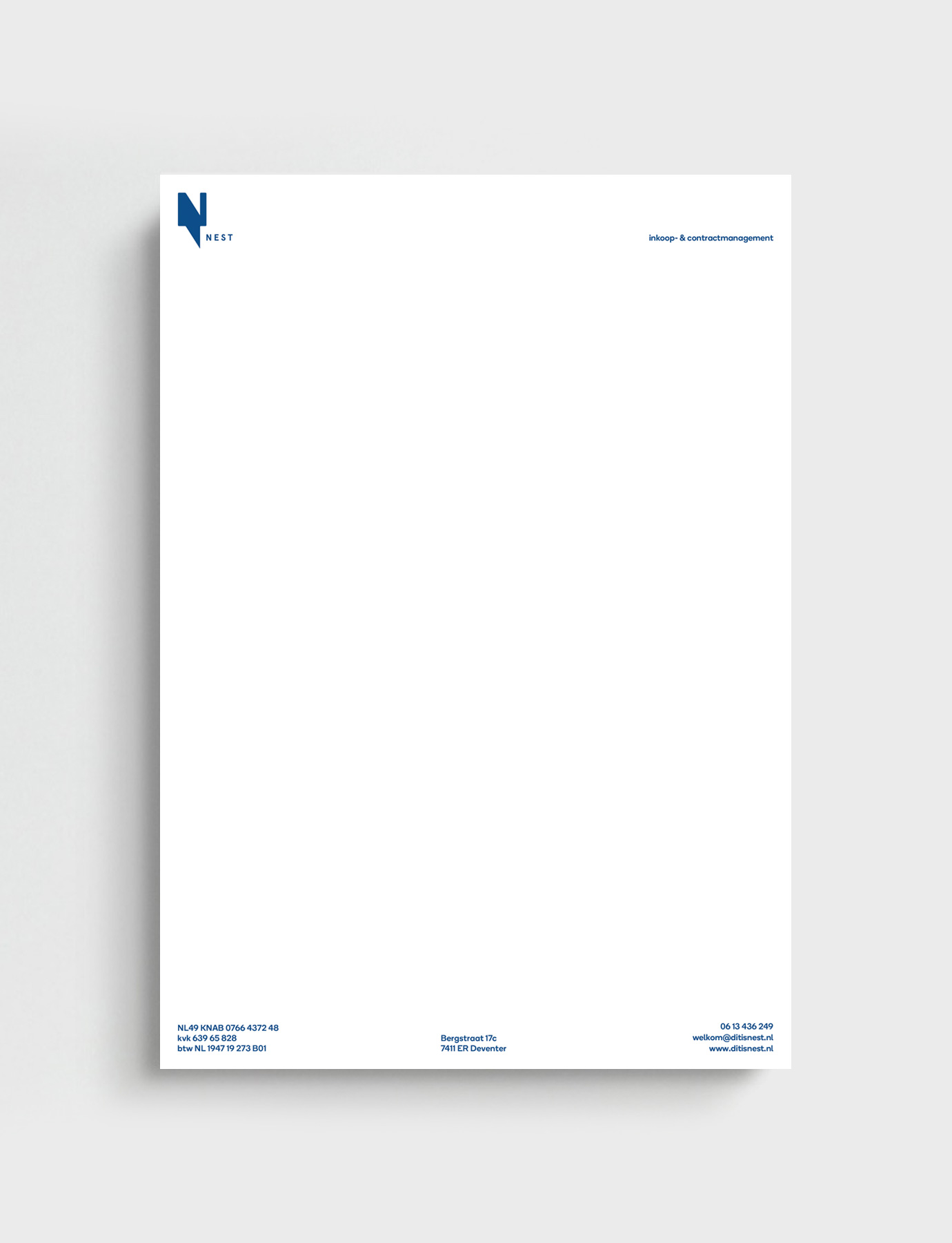
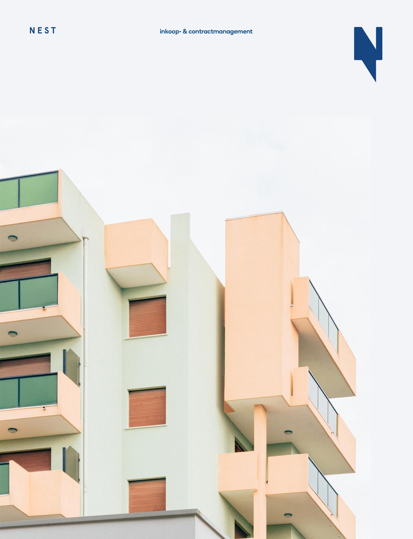

a positive future
Because of the social character of Peter Paul and the industry he works in, I have opted for a warm and approachable expression, by means of a friendly color palette and rounded typography. With the new identity, Peter Paul now has the ability to show exactly what he stands for and grow his business.