CJW Events
Creating an awesome day.
category
logo, identity & website
client
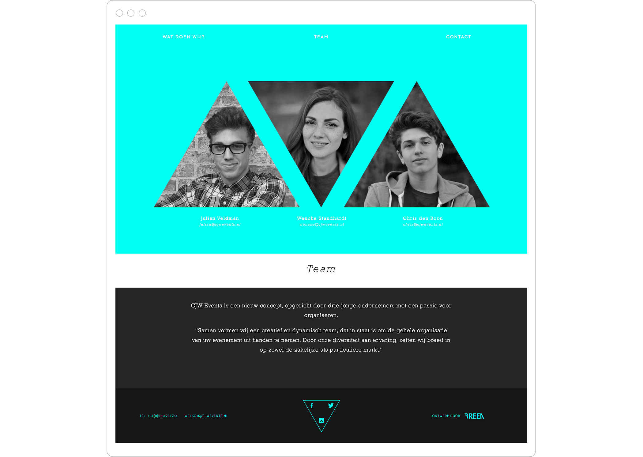
Chris den Boon
Wencke Standhardt
Julian Veldman
website
www.cjwevents.nl

the triangle as a symbol
CJW consists of a close-knit team of young entrepreneurs who needed an identity for their newly established events agency. One that reflects their ambition. Because they’ve known each other from a young age, they would like to see the triangle reflected in their new logo as a symbol for their unity.
the approach
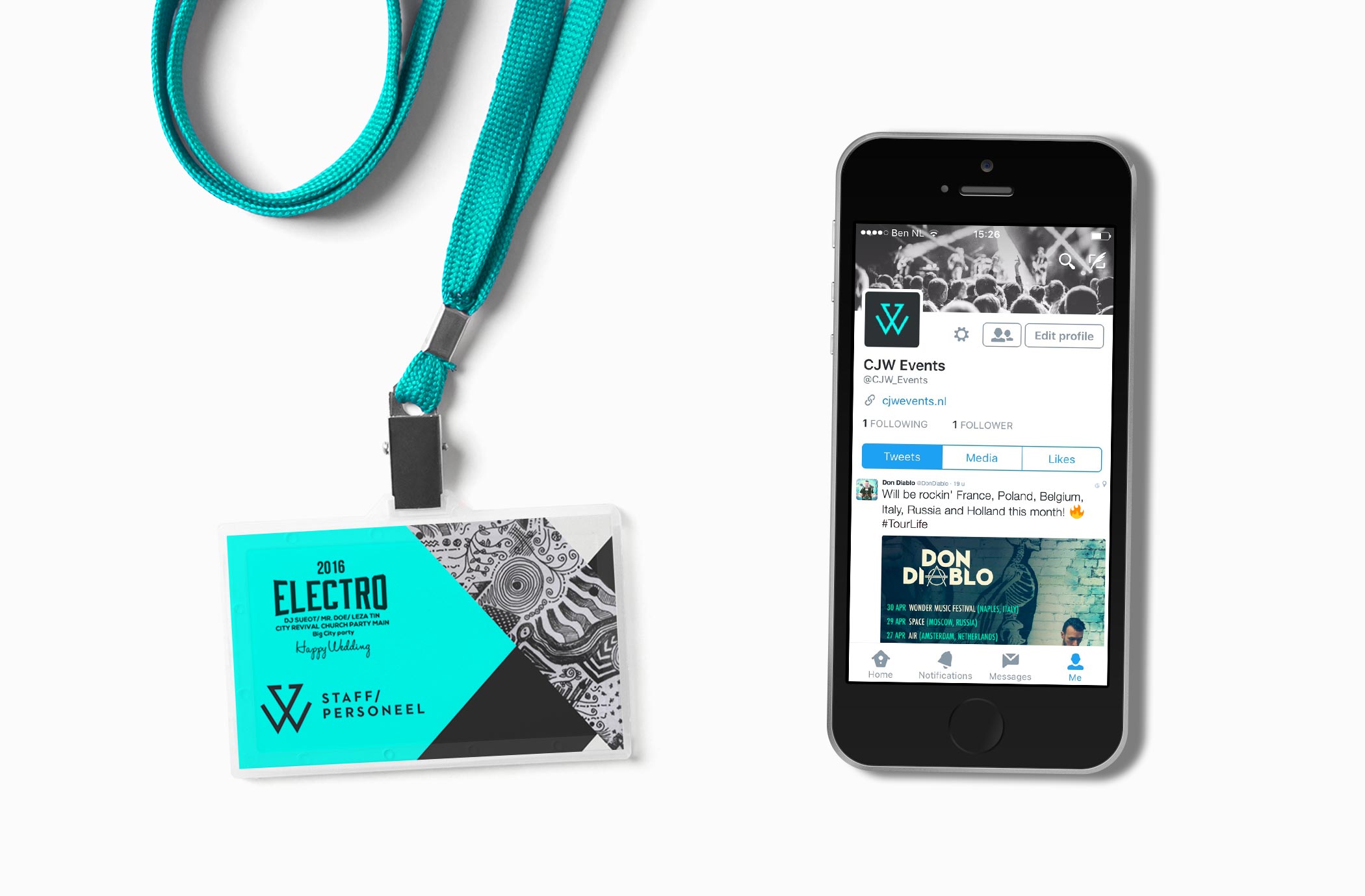
The events that CJW Events provides include company outings, festivals and weddings. This required an identity with two faces that can appeal to both the private market and the business market. Looking for a color that fits well with anthracite and one that increases it’s range, a vibrant and energetic color has been chosen. The logo consists of the abstracted letters C and J, together forming the W.
result
CJW Events has the flexibility to address both markets with a reserved and expressive color. A dynamic identity with an easily applicable logo that serves as a mark for quality.